Case Study
This is a course project for the creation of an original ecommerce website. Development of concept, target demographic, design of style guide and associated logo, branding, look and feel. Creation of wireframes and prototypes followed by user testing to identify areas of opportunity to address how users interpret and interact with the website.
Duration
10 Weeks
Project
Case Study
Original eCommerce Website
Roles
User Research
UX Design
UI Design
Background
TexSTYLE Exchange is a secondhand clothing reselling ecommerce company that bridges the gap between expensive vintage clothing stores and thrift stores. TextSTYLE Exchange differs from competitors in that it is the direct seller of merchandise versus a large group of individuals reselling their own clothes where the quality, customer service, and possible issues vary widely.
Research
Target Market
The demographic focus of TexSTYLE Exchange consists of discerning customers that are environmentally conscious and seek a selection of clothing that are of quality yet more affordable than new luxury goods.
-
Young adults with disposable income; Gen Z, and the upcoming Gen Alpha.
-
Working professionals with medium to medium-high incomes; Millennials, Gen X.
Research conducted on logo and brand colors started with color strategy. Color strategy focused on the target demographic and primarily young adults with disposable income and have growing economic clout: Gen Z. Color preferences of Gen Z have been connected to a sunny yellow that invoke qualities of the generation’s positive outlook: happiness, hope, positivity, and warmth. A variety of greens from brighter neon greens to the duller tones appeal to Gen Z’s desire for a more natural and analog environment and evoke a feeling of progress. Darker colors like deep shades of purple, plum, and black have been associated with Gen Z as these darker colors embody a sense of mystery, wonder, and escapism. These colors were pooled together as a starting palette and a decision of contrasting supplemental colors to complement them.
Style Guide


Design
Wireframe
The initial wireframes created an early placement of elements and structure based on early sketches of the sitemap, content and navigation.
.png)
Low-Fidelity Sketches
.png)
.png)
.png)
.png)
.png)
_JPG.jpg)
Medium-Fidelity Wireframe


Prototype
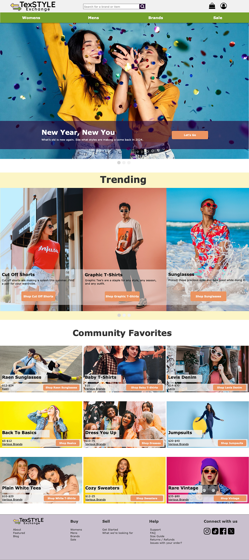
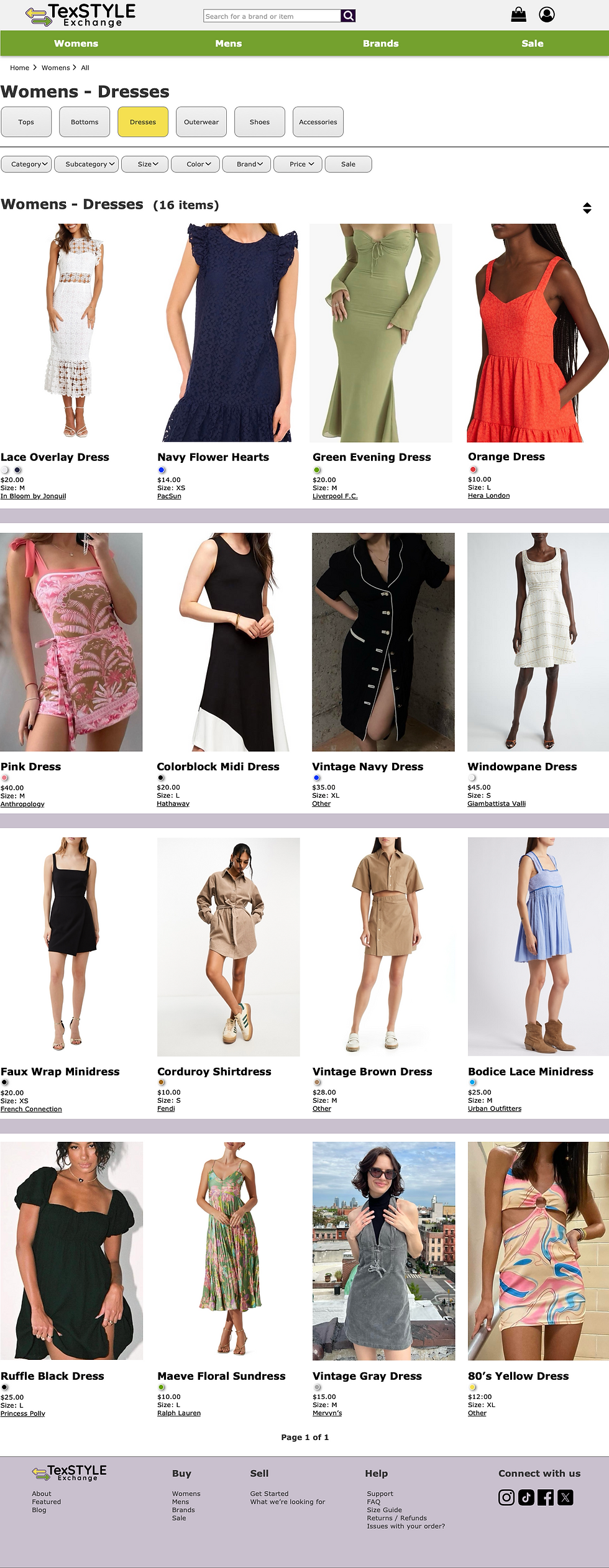
The prototype applied TexSTYLE Exchange’s branding, style guide, and logo. The benchmarking of similar ecommerce sites were used as reference points to incorporate cognitive affordances into the design. Interaction was applied to the prototype with slight aesthetic refinements in preparation for user testing.


Evaluate UX
UX Testing
The TexSTYLE Exchange prototype was used to conduct UX testing on 5 users spanning across the demographic targets that would have the most immediate impact on the business in terms of their ability to purchase items and sell their used items that contributes to TexSTYLE Exchange’s business model of procuring and selling used quality clothing:
-
2 users from Gen Z | Born 1997 - 2012 | Current Ages: 12-27
-
2 users from Millennials | Born 1981 - 1996 | Current Ages: 28-43
-
1 user from Gen X | Born 1965-1980 | Current Ages: 44-59
Evaluation approach and methods consisted of an observation followed by a questionnaire. Users were observed completing common user journey in e-commerce, identifying a product for purchase and completing the purchase process. This main task or selecting and purchasing an item was broken down to a sub-task per webpage.
-
Home page - Find an area to go to view dresses.
-
Category page - Find and select a dress to purchase
-
Item page - Review page, select item color, size, and add item to shopping.
-
Shopping Bag - Review shopping bag and go to checkout.
-
Checkout page - Complete the checkout form and submit your order.
-
Confirmation page - Review the confirmation page and return to home page.
A questionnaire was given to users after the observation as a summative evaluation of their experience and to provide a means to build a quantitative dataset to complement the substantial qualitative data from the observation.
Subtasks

Prototype Redesign
Based on UX test findings, redesigns were implemented to the TexSTYLE Exchange website prototype. Overall, user testing had surfaced the features and interactivity users were expecting that didn’t exist on the early prototype or were not working well in its current state. The most interesting information came from the qualitative data and underscored a desire for users to have a more vibrant experience: more color and personality associated with brand.
To accommodate this, the following were implemented across the prototype:
-
Text was made darker, larger, with more color contrast.
-
Images made larger and bolder in visual appeal.
-
Navigation dropdown revamped to be visually larger, contrasted, with additional images and color.
-
Features:
-
Hidden input for billing and payment information as default and presented only if/when need by user.
-
Informative images and related features: more images of angles of clothing on models, information on model such as height.
-
Information for purchase making decisions immediately viewable all at once (not hidden behind mouse clicks): color, size, selection of thumbnail views of items on hover instead of a clickable carousel.
-
Overall removal of information and images not useful to user and reorganization of information to be presented to users with the least amount of clicks or scrolling.
-